
VOLTA VOICES: HANNAH STRICKLAND
FOUNDER OF RELENTLESS ENTHUSIASM LTD.

Hannah Strickland, Founder of Relentless Enthusiasm and Graphic Designer of VOLTA’s 2020 rebrand.
Kamiar Maleki: Dear Hannah, tell us a bit about yourself and your work as a designer!
Hannah Strickland: I’ve been a part of the design industry for 7 years now and have never looked back. After studying Graphic Communication at University, I hurried into London with every other new designer thinking it was the nexus of creative jobs, but 2 years ago realised that there’s a whole wonderful world out there. I then discovered Bristol and its incredible creative community, so have lived here ever since with my wonderful partner in a little flat that became our sanctuary during lockdown.
Creating has always been a part of my life, inflicting homemade gifts on family from a young age (and still as an adult actually), as well as a love for reading and language. At the age of 11, I got my hands on a romance novel where the heroine was a Creative Director for a big New York Advertising Agency (when she wasn’t falling in love), and it was the first time I’d ever thought about the people that create the billboards and ads I saw on TV. In particular, reading about a woman in that role really stuck in my young mind. Once I learnt about graphic design and how so much of it is about visual communication – the beautiful blend of art and language – I was hooked.
KM: What is your process/method in approaching a design, generally speaking?
HS: A lot of my work focuses on brand design, helping businesses tell their unique story so that it's clear, compelling and in a way that will really make them stand out. I’m a huge believer that great design is based on great insight, so I’m a sucker for research. I will always spend time ensuring that I have a good understanding of my client, what it is they need from me (which isn’t always what they originally asked for) and the context in which the design will live – for example, designing an advertising campaign that will sit on billboards requires a very different approach to designing a magazine full of articles.
After the research stage, I will often create a few different stylistic approaches for the design, meaning my clients can see a real range and get a feel for what's right. It’s like picking an outfit – you don’t know what’s going to look good until you’ve tried a couple of things on. Once we’ve then selected one of the stylistic approaches, I then work with my client on refining the design to make it absolutely perfect. Throughout the whole process, I take the time to remind myself of the research phase to ensure we always stay focussed and don’t get distracted by something that might look beautiful, but not serve the purpose we need it to.

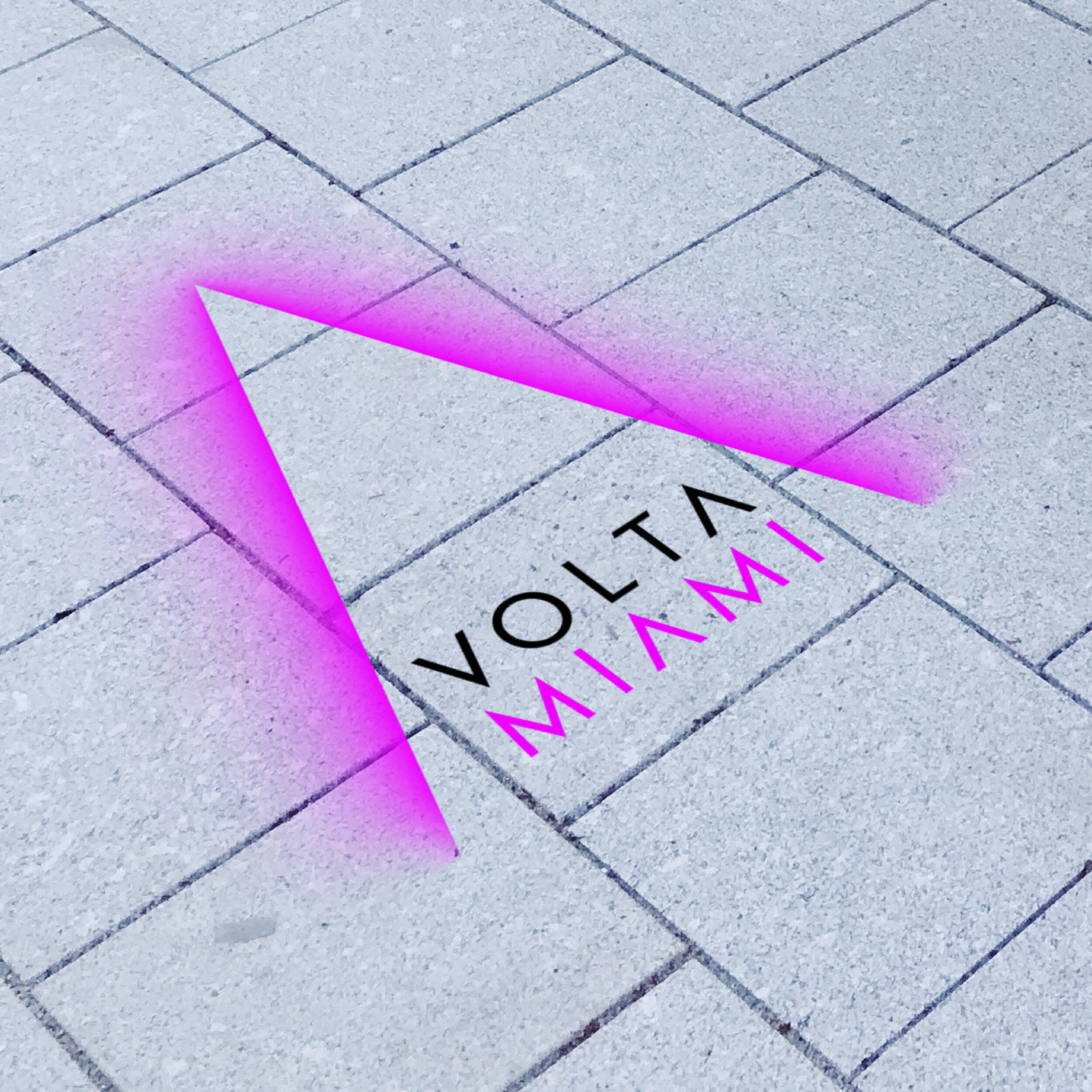
Hannah’s 2020 rebrand work for VOLTA.

Hannah’s 2020 rebrand work for VOLTA.
KM: What was it like conceiving and realizing VOLTA’s redesign? Which challenges did you face?
HS: Redesigning the VOLTA brand was an absolute dream come true, but at the same time I was filled with fear knowing the incredible calibre of artists that are represented at the fairs – how on earth was I ever going to do justice to such a brilliant brand? The good news was that the VOLTA team were so invested in making the new brand a success. The secret to any successful design is clear communication and a bucket load of enthusiasm, so a rigorous strategy phase before we even thought about the design gave us firm foundations to build upon.
With most brand redesigns there are challenges to be faced, and we had high hopes for our VOLTA rebrand. We needed to create a brand look that would make them stand out during the busy art fair season, be able to adjust each year to celebrate each new fair, look consistent across New York, Basel and Miami to build the presence for the new brand, but also feel tonally relevant for each fair location. Piece of cake, right?
I’ll never forget my first presentation to the VOLTA team with 3 potential stylistic routes for the brand redesign. We were only a few weeks into lockdown so it was all over Zoom, and everyone had muted themselves so that I could chat them through the design options. Once I was finished and I asked everyone which route they preferred, it was such an unanimous decision which I was thrilled about! I then discovered that they’d all been silently texting each other to confirm their favourite. Good news was though, we had a clear winner!
KM: What influences did you draw upon?
HS: Interestingly, it was the way the VOLTA team spoke about their artists that lead me to our design approach. I often find that the simplest ideas are the best ideas, and when the team discussed how they wanted their fairs to be a place where artists and their work can be celebrated, the first thing I thought of was a bright spotlight. Once I started scribbling shapes that spotlights create, it didn’t take me long to find a connection between a beam of light and a perfect graphic V shape for VOLTA. From there I immersed myself in different ways I could bring this to life for the brand redesign.
In the strategy phase we’d defined key words to represent how we wanted the brand to look. These were my guiding light (it’s hard to not include at least one light pun) when exploring the visual representation of the brand, and I referred back to these continuously throughout the process. Because we were unable to hold a photoshoot to create imagery for the brand, I focused on reference that was quite graphic and that could be created digitally. An artist that was a big source of inspiration for me was Dan Flavin, whose sculptural light installations were perfect examples of striking and vibrant glowing compositions.
Whilst this approach to light was our starting point for the brand redesign though, the purpose of the spotlight V is to allow the brand to continue to evolve in the future whilst maintaining a strong visual consistency. Our spotlight V can act as a type of frame, holding a whole range of images and styles that can change each year to refresh the look of the fairs.

San Fran Poster designed by Hannah when working at the agency Purpose, depicting the San Andreas fault line running through the city.
KM: How does the world around you inform your practice?
HS: Like many creatives, I can confidently say that the entire world informs my practice. When working on a project, I never just look within the relevant sector or at similar design projects (although I do spend a lot of time researching these of course). I once brought home a set of totally unneeded ingredients from the supermarket because I really liked the packaging and I felt that the typeface would work amazingly for an infographic I was designing at the time. Inspiration can hit you anywhere, even in the canned food section.
I also like to try new crafts or mediums of design that I’ve never played with before. Because I spend a lot of time working on a computer, I find I set myself a very high standard for ‘pixel perfect’ design, so I actually take a lot of joy out of trying something where there isn’t a lot of pressure on the end result. I’ve created some horrendous pieces of pottery in my time and loved every second of it. It allows me to get out of my head for a little bit, so that once I get back into a design project afterwards, my focus is razor sharp.
KM: Do you have a favorite artist or designer?
HS: My favourite artists and designers change very rapidly. Sometimes daily, sometimes hourly. There will always be heroes of mine that I continue to return to as a source of inspiration though. Herb Lubalin was an incredible American designer whose wit and intelligence is so present in his work (Google ‘Herb Lubalin Mother & Child logo' right now, and then thank me later), and I distinctly remember the moment I first came across his designs – I gasped. I have a deep appreciation for what is known as ‘a smile in the mind’ design, which Lubalin embodies completely.
I love nothing more than finding someone new to obsess over as well though. Netflix currently has a brilliant series called ‘Abstract: The Art of Design’ which introduced me to Cas Holman, a designer of objects that inspires children (and adults) to play creatively. Both her career journey and way of thinking are massively inspiring.
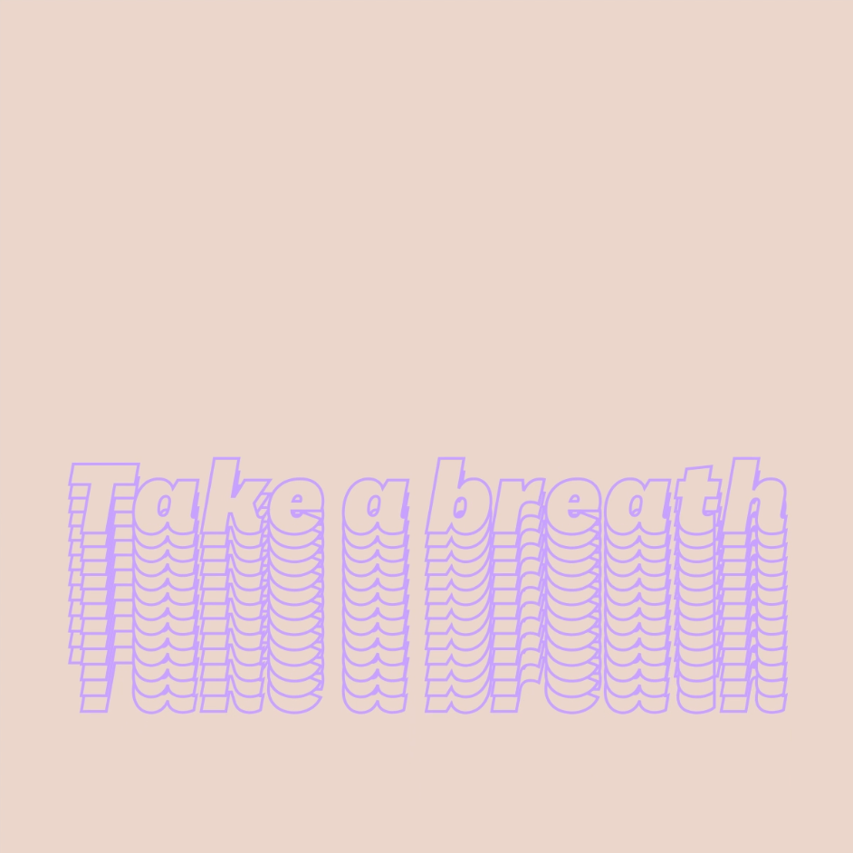
Animated type experiments: Take a breath.
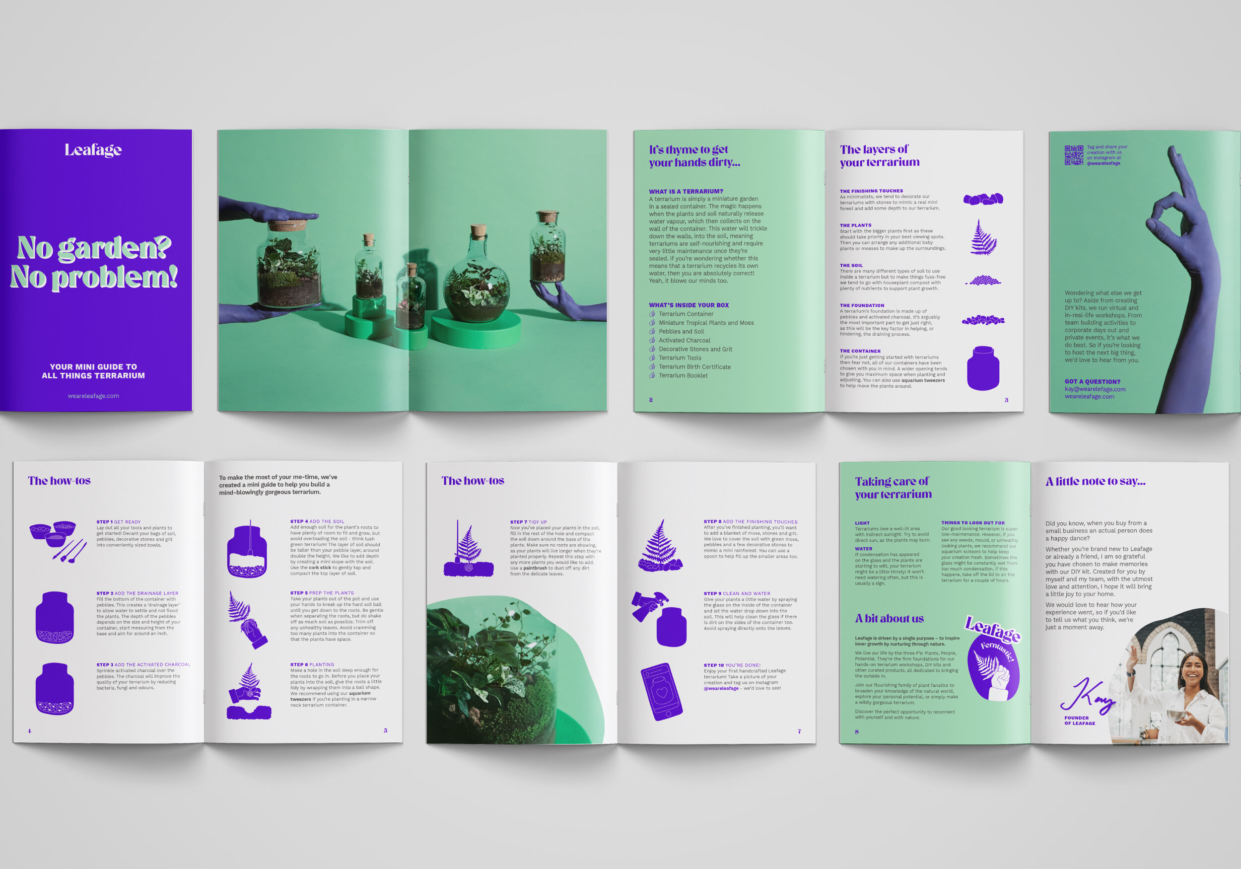
Leafage brochures.

Animated type experiments: Melting from home.
KM: Which current and future projects you are working on?
HS: In the last few months I’ve gone solo and become a freelance designer, so am working with my very own clients for the first time which has been really wonderful.
A big project that I’ve just finished is a rebrand for an incredible company called Leafage (@weareleafage) that hosts workshops and sells kits that allow you to create a terrarium – a glass vessel filled with plants that you can display in your home. As a brand they have a strong focus on wellbeing and using their workshops as an opportunity to have a little me-time, whilst also being full of joy and energy! Their previous brand wasn’t quite expressing this, so I worked with the founder of the company to redesign their entire brand to communicate this more clearly for their existing and future customers. We just laughed the whole way through the process, from designing stickers with cheeky plant puns, through to painting models purple for our product photoshoot. It’s been such a blast.
Since lockdown I’ve also taken on the task of fine-tuning my animation skills. Every couple of weeks I create a typographic animation, using the styling and the message to reflect a certain thought or feeling that is relevant at the time. I’m finding that they’re just as soothing to create as they are educational. And much cheaper than therapy.
With regards to what the future holds, there’s nothing I’m allowed to talk about just yet, but watch this space as it’s going to be a lot of fun!

Leafage Tropical terrarium.
Follow Hannah Strickland on Instagram at @relentlessenthusiasm, a one-woman band that approaches every creative project with vim and vigour.
VOLTA Voices, our initiative featuring interviews conducted by Director, Kamiar Maleki, who brings the voices of VOLTA’s past, present and future to our growing audience. Read the interview series on the blog and be sure to sign up for our newsletter to stay up to date on all things VOLTA!